
Digital Accessibility

Accessible Content Basics

Five everyday practices that make documents, webpages, and videos usable for everyone.

Why It Matters

Small habits, big impact

Most accessibility problems are created one document or post at a time, and most can be prevented with a few everyday habits. These practices apply to webpages, documents, slides, and videos alike, and they make content easier for everyone to use.

Five Everyday Practices

These foundational practices make digital content more accessible, and they are often easier to apply than you might think. Select a topic to learn more.
Side-by-side comparison of color contrast in text. Left: White text on a dark blue background is marked with a green checkmark for 'accessible.' Right: Grey text on a dark blue background marked with a red X for 'inaccessible.'
Readable text relies on strong contrast between text and background colors. High contrast ensures that users with low vision, color blindness, or small screens can comfortably read your content.
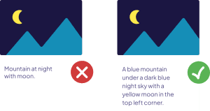
Comparison of inaccessible and accessible alt text: the left example provides minimal, vague descriptors, while the right example includes a detailed, meaningful description of the image.
Alt text provides a short description of an image so screen readers can convey meaning to users who cannot see it. Good alt text focuses on what the image communicates, not just what it looks like.
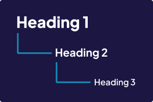
A graphic illustrating the visual hierarchy of HTML headings: Heading 1 appears bold and largest, Heading 2 is medium weight and smaller, and Heading 3 is the lightest and smallest.
Proper use of headings (H1, H2, H3) organizes content in a way that screen readers can interpret, whether in webpages or PDFs. Clear structure helps all users navigate more quickly and understand how information is grouped across digital documents.
A graphic showing two examples of hyperlink text. The first is labeled 'Click here' and marked with a red X to indicate a vague, inaccessible link. The second is labeled 'Fill out our survey' and marked with a green checkmark to indicate a meaningful, descriptive link.

Links should describe where they lead. Instead of “Click here,” use descriptive text like “Download the field trip form.” This supports both accessibility and comprehension.
Side-by-side comparison of video accessibility. Left: A video without captions marked with a red X for 'inaccessible.' Right: A video with captions marked with a green checkmark for 'accessible.'

Videos and audio recordings should include captions and written transcripts so users who are deaf or hard of hearing, or anyone in a quiet or loud environment, can access the content.
Next Step

Ready for the bigger picture?

The Compliance Roadmap shows how to find, prioritize, and fix content across your whole district.

Disclaimer: The content on these pages is for educational purposes only and shall not be considered legal advice or guidance. It is not a comprehensive list of all accessibility requirements. LTC does not serve as a relevant regulator or auditor and shall not be held legally responsible for how this information is used.